Saturday, March 25, 2017

Journey to creating a Paladins Map

When I first set out on the mission of creating my very first Paladins map, I started off with studying all the levels of the game to figure out "What is it that makes a Paladins map, a Paladins map?" My findings were very clear to me once I had gone through each map a few times to be sure my findings were correct. Of the 3 different types of maps, I decided to go with Siege maps, and with them, I found them to each have 3 sections with their own features, and they are as follows:

Defender's Area - The area right outside the spawning zone that encompasses the final stretch for the payload
The Transition Zone - The distance between the Defender's Area and the Central Point
The Central Point - The Area where all the initial fighting takes place, either on it or around it.

But what made each of these areas unique?

Defender's Area
 - Defenders always have the high ground advantage at their base
 - There is no way for attackers to get up on the high ground unless they sneak into the main area of the Defender's Area

The Central Point
- It's almost always the lowest point of the map
- There is always multiple paths to approach the area, usually 3 paths.
- This means there is always flanking opportunities
- Very distinct line of sight breaks that means the player never has a long line of sight on either of the two flanking options, but sometimes has it with the middle road.
- There's always multiple levels of elevation around the middle area.

The Transition Zone
- People can quickly move to The Central Point
- Has multiple level of elevation on either side of the main path where the payload is on
- Always has a winding path

A lot of this can be made out on the Temple Isle map. It has the clear distinct winding path the payload has to travel, first it goes left and then right and then left again. There are very clear line of sight breaks for each wind, and the defenders have a clear high ground advantage when payload comes close enough for the final area.

https://static.pressakey.de/gfxtrailer/poster/Paladins-Temple-Isle-Map-Reveal-Trailer.jpg

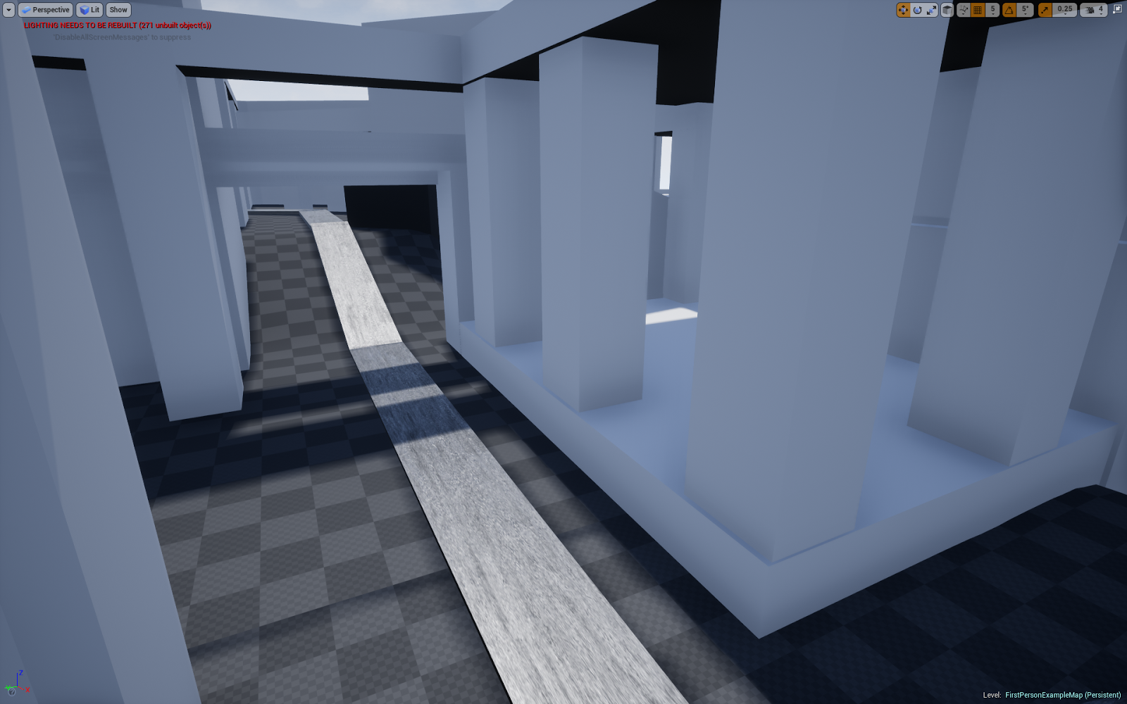
These were all features I needed to incorporate with my own design if I was to ever successfully create a good Paladins map. After getting some inspiration for what I'd like to make thematically, I went to work on drawing out a decent sketch I could work off of so I had a clear idea of where I wanted to go with the design. I wanted to do a bit of an Greek or Egyptian vibe to it where Pillars played a central part in the map's design.

The sketch turned out decent with it looking like this:

Not the most beautiful drawing in the world, but it set up some of the basic ideas I really wanted to do with my map. However, several changes were made once I built the basic concept. The line of sights were terrible with this layout, far too open, and the winding paths needed more sharp turns. Several more changes were made between the first iteration and the second one, and several more are needed for the third iteration of the map. It should be decent once the third or fourth iteration comes around and then it will get its beauty pass.


From the initial whitebox I went to work on balancing out the size of the map to fit more along the lines of what a Paladins map should be. To do this, I went through the different champions of Paladins and picked out the ones with great movement powers, recreating them in Unreal, and then using them as a benchmark for how big areas should be. The four champions I focused on were:


They provided a great foundation for all kinds of jumps, leaps, dashes, teleportation, and flying. If these characters couldn't move around in a good way that felt similar to a Paladins map, then the map definitely wasn't living up to what it should be.

After some testing to get their moves just right, I found my map size for all areas to be at the very least 20% too small for them to comfortably move around. After sizing up the map some more, I got to work on putting in all the art from the pack I bought so it got an aesthetic style somewhat similar to Paladins. And finally, lighting was put in at the very end to give it a nice atmosphere.

Sunday, December 11, 2016

Last Assignment - putting car in engine

So, for the last bit I set up a simple scene and imported the mesh of my car and the two sets of textures, one for the car and one for the decal. Once implemented, I put it together and placed it in the small scene to take some screen shots


Sunday, December 4, 2016

Week 8 - Decal and Mental Ray

For week 8, I started out with creating a decal that would fit the shape of my car by doublicating the area where it needed to be and textured it with a photoshop picture that I edited to only be the decal and not any background material for it. So, first I found something and then edited it in photoshop.


Once edited, I started the process of creating a new piece of my car for it to go onto.

 doublicated the car and then I inversed the selected area I wanted and deleted it so I ended up with the area for the decal.

 I then went on to import the texture as a lambert and then UV edited it so it fit properly.


And finally, the decal was in place and look great


Started working with mental ray and applied a car texture to it.

After adding some metallic shine to my car, I finished it off with creating a glass like texture for the windshield and headlights.


Sunday, November 27, 2016

Week 7 - UVs and simple texturing

This week I touched up on the car model a bit, fixing the issues I had with it instead of just making it all over again which would have been easier. But, in an effort to learn the tools better, I figured fixing it would be the best approach.


One thing I really got to practice was removing faces and sewing together vertexes so the area looked right again. But after this was done, I went on to do the extra parts to make my car something different. I went for one of the police car references and therefore made a bumper thing for the front and the lights for the top.


 the UVing which didn't make too much sense to me with the tutorials provided. I didn't understand what was being explained in terms of why we were stitching the UVs together and why resizing them to the UV mapping texture as it didn't seem like that overall mattered for when doing the simple color texture. Regardless I tried to do some of it, and it did end up looking alright once textured.


Though, I'm sure I have a lot to learn in terms of UVs and how they work so hopefully that will be explained during next class session.


Sunday, November 20, 2016

Asssignment 6 - modelling a car

For this week I got more intimate with Maya. Following a set of videos I managed to set up reference pictures for what kind of car I was going to model which allowed me to much more easily change up the shape of a cube so it matched the general shape of the car in question.

I took the picture of the car and cut it up into its separate components so I could easily model the cube.


Once images were set up, it was all a matter of pulling vertices until I had the general shape. Keeping this thing under 3k tries was very difficult and if I could have gone above it, I would have made a lot more details and done some things differently. But at least with making this, I learned a lot of new tools to help make models. I got more familiar with shaping a cube like it was made of clay, and I got to experiment with reducing faces, merging vertices, and duplicating half a car into a full car.


Sunday, November 13, 2016

Week 5 Assignment - Make it Pretty


For this week all I really focused on was prettying up my level and changing the layout of the challenges to fit the new assets I could use. Besides this, I only added 2 more mechanical things to the world. The first is a blueprint that counts down time and ends the level if you don't finish on time, and the second one is a victory screen if you manage finish the level. I also added some ambient sounds, music, and sound effects.